Wednesday, April 23, 2008

image essay #10


Bed by Robert Rauschenberg, 1955. This piece by Robert Rauschenberg is one that I find particularly intriguing. For me, when an artist incorporates several mediums I am automatically draw in. It is very interesting to see how someone can take varying objects and mediums and make them relate to one another. It is like music with several different instruments. Rauschenberg does this famously over and over again throughout his many works. In ‘Bed’ he uses mediums including, a quilt given to him by artist Dorothea Rockburne, paint, pillow, nail polish, toothpaste, and sheets. The colors shift your eyes back and forth. The media and colors play together nicely to create this scene that invokes different meanings. What is this bed that we are seeing? Is it a scene of violence, of dreams, of love? And why are we looking at the bed straight on? Is it on a wall, or are we omnipresent above it? What I believe Rauschenberg does so successfully here is to let the viewer decide why this bed is important, and what it means personally to the viewer; with every varying person, is a different meaning. For myself I look at it being a representation of dreams bleeding and perhaps fading; the inability to hold them.

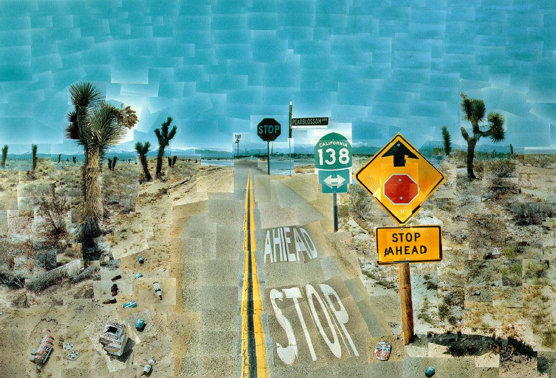
image essay #9


Pearblossom Highway, by David Hockney. This is a work is a photographic collage. Hockney took hundreds of photographs in order to compose this piece. It is very interesting due to its piecey texture, the rectangles of each individual photograph. This work initially drew my attention because of its interesting uses of scale. The photographs as a whole looks like a realistic setting, yet you notice that the sizes of objects within do not exactly portray actual perspective. Aside from the collaboration of images, the work utilizes an attention grabbing color scheme. The foreground consists mainly of shades of yellow orange and red, and dances nicely with the contrast of the blue sky. Due to Hockney’s color present here, the viewer’s eyes jump back and forth between foreground and background. The deep, and perhaps shocking red in the signs adds a pop and a focus point to the piece, which makes one question the meaning of the photograph. Is it merely the capture of a place, or is it a warning not to go further?

image essay #8


Birthday Boy, by Eric Fischl. Eric Fischl's paintings deal with the coming of age for mainly young adolescent boys. In Birthday boy, Fischl portrays a young boy on a bed with a much older woman. Both figures are portrayed nude. It is unclear the exact relationship between the two, but nonetheless we get the sense that the boy is seeing something he should not. There is certainly a feeling of inappropriateness, and uneasiness for the viewer. I believe the first reaction is that one should not be looking at the two of them, as if the viewer is invading their privacy. Yet when you allow yourself to look further there is this uncomfortable ness. We question why is this young boy with, and looking at the woman. Also the positions of the two figures give way to further questioning, such as why the woman’s legs are spread. They are very suggestive. It is unclear to me whether the woman’s left leg is simply in the foreground or actually touching the boy’s shoulder; the answer could lead the viewer to secondary questioning. Fischl does have an extraordinary capability of color. The painting has this remarkable red and gray tone. I believe that the red makes the viewer feel embarrassment, and also may imply sex, passion, exploration and temptation. Birthday Boy is a very successful painting with its interesting subject of the boy approaching puberty, as well as its great use of color.

Tuesday, April 22, 2008

image essay#7


Sally Mann displays brilliant value in this 1992 photographed titled, Shiva at Whistle Creek. Mann has a fantastic capability of captivating a person with her rich contrast in photographs. There are many different values inherent in each of her works, and this photograph is a great example of her professionalism. She has a way of focusing on the subject, but also allowing the subject to appear soft and welcoming, there are no edges that are to harsh. The way in which she captures her subject, with the enormous ability of seeing detail, one can almost see color. This photograph is very alluring, there is the sense of both watching the young girl from above, or what I feel almost instantaneously is that I am the young girl. Perhaps Mann is invoking these positions onto the viewer. In any case, the image is calming, and certainly captures a setting in which you can hear the trickling of water, and image the cold, feeling the innocence and the freedom of a child.

Thursday, March 27, 2008

image essay#6


I attended Daniel Graham's lecture last evening, and to my surprise I was left more inspired than I could have imagined. Daniel Graham's lecture was quit fascinating to me. I believe that first of it was his character that captivated my attention. He presented himself as a very genuine man. He did not fear being humorous, and that was a quality I much admired. His reflection on his work, however, is what most enthralled me. When he spoke of his art pieces they were not this simple concept behind the work, but these elaborate metaphors on life that pertained to every single material he used within a piece. There was a tremendous dialogue I saw between him and his art; this poetic chemistry. Everything had detail and was thought out. The greatest attribute to his work was that he intertwined his memories (whether embellished or not).I related to Daniel in this sense because I articulate reason for every inclusion of material; I really appreciated his thought process.
The workshop this morning was very interesting. We began with an exercise as difficult as re-writing a fairy tale. It was trying to come up with a reclaimed story in a matter of minutes, yet the practice was worthwhile. After that portion we went on to make a list of phrases that would illustrate our feelings or memories towards a color. At the end of this we used one line from the fairy-tale retelling as well as a line from the color depictions, making a brand new unlikely sentence. Mine was: "She could see the future, dull, verging on passion." Then in groups of eight we took each of our sentences to form a story. Daniel's purpose behind all of this was to show us, how at first our ideas lack what it takes to make pieces of art; and that through examination and combination we can create a more profound work that relates a larger variety of feelings and emotions.
From our group’s stories, we created characters that pertained to our own sentences. We were instructed not to merely illustrate our sentence, but rather create a character or picture that contributed to the purpose of our sentence. I chose to draw binoculars that were a way I imagined my character could "see the future." Than we collaborated to create a scene in which all of our characters interacted.
I enjoyed this workshop very much, and that it was a great way in which we could tangibly explore our imagination and further our own understanding of our ideas.

Thursday, March 20, 2008

image essay#5


My hope is that what I am taking so much time to do with this project, taking risk and making this piece a true example of my concept, is evident now even in the beginning stages. I am quit aware that I have so much work ahead of me, but I am not fearful or discouraged but mainly exited and dedicated to the execution of the piece. Instead of 11x17 paper I am using a 17x24 piece of ply wood that I painted white. The image is drawn on symmetrically, and where the "halo" is around the figure-I've painted it gold, with yellow beam lines. I incorporated color into the piece because I think it makes the concept and the symbolism three-dimensional. For me the color yellow is representational of God, light, warmth, and love. It is also the color that is typically used as the color of halos in paintings. So my using it draws the viewer to the irony of this glowing religious and violent figure.
I also chose the wooden board because I plan on attaching my textures not by gluing them to the surface, but rather nailing then to the board. I thought of using nails because there is a sense of drama with them and the literal "hammering in" of ideas. I believe in the finished piece you will be able to see the image, but also there will be these nails that extend forward; and from the side angle of the piece you'll be able to see the amount. Also I am using mostly, if not all, transparency papers for the texture, rather then normal paper. I feel that by using transparency I will have this great effect of overlap; and conceptually I am using transparency paper because the terms in which I am voicing 'wrath' are not transparent--they are complicated and under communicated, so once again I'm playing with irony.
I am sorry that I can not physically show you gestalt principles in the piece do to lack of texture at this time; however I can assure that those principles will be applied with the utmost concern.

Wednesday, February 27, 2008

image essay #4


This painting entitled "Beethoven frieze: The desire for the luck," was painted by Gustav Klimt one of my favorite painters. He so eloquently details his paintings with elaborate textures and designs that are extraordinary for anyone to look at. When first viewing this painting I notice the stark gold of the knight against the white background. It is clear that the knight and the women dressed behind him are the object of our immediate attention. Then our eyes follow back to the left where the nude people stand pleading. Also from this portion of the frieze we also see one woman in the upper left corner on a cloud. The piece has a true sense of omission played by the knight ignoring the pleas, as well as the spaces that are without texture. The way the nudes are painted is relevant to there emotion. Their bodies are sharp and fragile. Perhaps these people are begging for money, are maybe more simply clothing. In either case the knight appears selfish and arrogant along with the women behind him appearing in vanity. The piece is agile and thrilling. There is a certain sense of romance, as in all of Klimt's painting; however this is counter played by people desperation. This piece is beautiful.