Gordon Matta-Clark: "You Are the Measure"
March 4th 5pm
Museum of Contemporary Art Chicago, Illonois
Exhibition
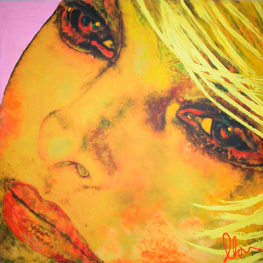
I attended the exhibition "You are the measure" by artist Gordon Matta-Clark (1943-1978). Matta-Clark's work in this exhibition was from a whole array of mediums including building cuts, sculptures, photographs, drawings, films, and notebooks. His work filled the entire first floor of the gallery. The main attraction of the exhibition was Matta-Clark's building cuts. His work is all relative to one another. He makes cuts, many of which are elliptical, through buildings. He will make these cuts through floors, ceilings, walls, roofs, windows, mantels, staircases, exterior walls, or a combination of the elements. In the exhibition he had photographic documentation all throughout the gallery; he also had a film projected in an interior room. The two main rooms had a collection of his "cuts" spread around the space. Spectators were able to get close to the sculptures and walk around to see all angles.How did you interpret or react to what was presented to you? I thought that this exhibit was very intriguing. I did not go to see Matta-Clark's work, but I was impressed by it. I had never heard of his work, and I had never seen work that was quit like it. I enjoyed seeing the cuts, and perhaps even more so the photographs of them. The photographs were taken inside the building, and it was so interesting because you saw this room, but then apiece was missing and what you had instead was a peak into another room (or more). I also liked that these buildings were in big cities such as Manhattan and Chicago because I saw interiors that I am not normally exposed to. I was also very impressed by the mere ability for Matta-Clark to actually make these cuts, and make them relatively clean and supported. I imagine that each cut he made must have had very much planning previously. I think that he had a good I for what is appealing. I think it took him to make this art that he cared about and have it be attractive, rather than someone who just cut into buildings. I would give this exhibition a rating of ten, it was an interesting learning experience for myself, and I am glad that I had the opportunity to be exposed Matta-Clark's very original pieces.
Friday, April 25, 2008
Thursday, April 24, 2008
artxpose three
The Lion King {theatre production}
March 8th 8pm
The Stranahan Theatre
Play [musical]
I attended the Tony Award winning musical the Lion King on March 8th at the Stranahan Theatre. The stage performance is based on the 1994 Disney animated movie. In addition to the musical numbers from the movie, area new set of original songs incorporated. The musical debuted in 1997, and is directed by Julie Taymor. Taymor was also responsible for the designing of all the costumes of the production, as well as the design of the puppetry. Although the stage version is based on the animated movie, there is a completely different feel. The stage production takes away the children’s cartoon feel and spins it into this African tribal performance. The original songs, costumes and puppetry truly mimic African culture.From the very first scene of the play I was absolutely blown away. I was overwhelmed my so many elements. From the actual adaptation of the stage, to the signing that was so powerful, and the costumes and puppetry that were absolutely out of the world! Perhaps the combination of all these elements is what made me feel like I was a part of this piece somehow. I was actually brought to tears at a few sections; the meaning of this story, and the way the actors were the animal characters. It was like experiencing Africa, a symphony and ballet simultaneously. There was so much constantly happening on stage and so much rich detail. I found myself focusing on one thing, such as a characters puppet, in order to understand how it worked. Every single second of the performance was a beautiful piece of art. It was a feast for my eyes. I believe what impressed me the most were the costumes. They were so unusual and inventive, it was impossible to take it all in. During the performance I fantasized about fashion design and mimicking the color pallet present in Taymor designs. I give this production something that is beyond a ten. I don't know if numbers could be appropriate for something so complex, intricate, and emotional. I would recommend anyone to see this musical it is phenomenal.
artxpose two
Russian Ark
April 10th 7:30pm
Dorthy Uber Bryan Theatre
Film
April 10th 7:30pm
Dorthy Uber Bryan Theatre
Film
I attended a showing of Russian Ark a 2002 Russian movie directed by Alexander Sokurov. The film lasted approximately ninety minutes and spoken in Russian with English subtitles. The film has absolutely no cuts, it is a continual shot. The piece shows thirty-three rooms, and has a cast of over two thousand. An unknown narrator is present throughout the film directing our view of the world. He is accompanied by a "European," it is unclear there relationship exactly, but it seems they may be ghosts. They walk through various settings, such as a palace, museum, and courtyard. The entire movie is filled of settings of Russian history.
I was amazed by this film first off due to its costumes. The costumes were brilliant works and appeared historically accurate. Also the makeup was done very well. The settings were stunning; it felt as if I was really walking through a palace, a museum. Because of the narrator moving the camera, I felt I became him. Each room was different and elaborately decorated. Due to the film being filmed as one shot there was certainly a continuum I felt; as if it was taking place right before me and the same time framed existed, unlike most movies today. Although there were all of these interesting components in the film, it lacked a good story line. There was uncertainty thought the film as to what was going on, perhaps they were trying to make it appear dream-like. However, I became bored and felt as if the piece was dragging on. I would give Russian Ark a rating of seven. The points are awarded for the creativity and ingenuity of the piece, but further points are withheld due to the films poor story.
artxpose one
MFA Thesis Exhibition {Momoko Okada}
April 14th 7pm
Willard Wankelman Gallery
Exhibition
I attended the Master of Fine Arts Thesis Exhibition on April 14th. I paid specific attention to the work of Momoko Okada whose work was displayed in the Willard Wankelman Gallery. The lighting of the room was dim and warm. The light created an intimate setting. On the entry wall to the left hung several ovals with images of the artists work, as well as a painting around the works. There were five metal-work sculptures presented to the viewer on wood and iron stands made by the artist. There was also a narrative video of two-thousand images also created by the artist in a sectioned-off corner. Momoko remained in the Gallery the entire evening to meet spectators, and perhaps explain her works. Momoko's work was quit stunning and what I believe was the highlight of the exhibition (thus my focus on her). I was so intrigued the amount of colors Momo manipulated on the metal. Also the delicate details that was apparent in each piece. She used a wide range of metalsmithing techniques that added much interest to the individual pieces as well as the whole. All of her works came together cohesively. The organisms were enchanting, with her use of other mediums to compliment her work (e.g. wood, glass, fibers). It was clear that Momo was highly invested in her work and that she had a passion for creating these organisms. I believe I was most impressed by her finite detail in pieces. The time it took these pieces was something that was definitely on my mind, as well her skill. I was very enthralled by her originality all thought the gallery; she included mounted graphic prints, a video, handmade tables, and interesting lighting figure. I think that Momo has been living and breathing these creations for sometime, and they were truly alive at the exhibition.
I would give this exhibition a rating of ten. I give it a ten because it stands out as the most impressive collection of art I have seen all year. Her work was fresh, lively, poetic, and absolutely stunning.
Wednesday, April 23, 2008
{blog entry 4}


Sunflowers, Vincent Van Gogh
I believe this piece contributes to a different understanding of the world (i.e. art), because Van Gogh is using an analogous color theme here. Every one of the pigments, including the white, has yellow within them. It is warm and joyous, very much expresses of sunflowers. Sunflowers differs from Van Gogh's other works because it is analogous. Typically we see his works using complimentary color schemes (i.e. Starry Night). By repeating the large elliptical head of the sunflower, Van Gogh has put in place a dominance structure in which we are focused on the flowers, and moving our eyes around to see each one. This painting does not necessarily relate to the human form, however it relates to humanity in the context of flowers being a decoration in a vase, also in the setting of a room. I have been vastly influenced by Van Gogh as a human being foremost, and as an artist as well. My mother, a social worker, had a great love for Van Gogh's mind, life, and capability as an artist and she past those respects to me. Reading his letters gave me an incite to the person behind the artwork giving me a deeper appreciation for it. The ways n which he uses yellow here are so brilliant and alluring and I have captured that same love for the yellow.

 Dresses by Paul Smith& Proenza Schouler
 I believe that in each of these examples the artist has revealed a different way to look a color in the context in texture. They each have also changed the color world by designing clothes in which the color scheme is not obvious, perhaps bizarre to some. Mainly Smith and Schouler have taken risks using color. These two examples of fashion standout amongst other such garments because in there unique combination of colors, textures and patterns; both are completely original creations that are very appealing. Paul Smith's frock starts with an upper portion that swirls a very interesting spectrum of colored flowers, including black, pastel pink, sea foam green, and cobalt blue. The length of the dress is done in white silk with shades of yellow, green, light blue and red throughout. In Schouler's dress we see an overall violet color with the upper portion being a transparent white, and a red beaded necklace. The dress contains several added pictorials in green, peach and orange. The garment is complimented by brown tights, and pink and red shoes. Both of these examples redefine are typical rules of color, they create a fresh piece that is attractive. Smith uses the length of her dress and its existential lines to lead the viewer to the dominant black strip at the bottom of the dress. The black of the dress bounces our focus back up to the top where she wears a black and purple scarf. In Schouler's piece the purple is dominant, but a close second and third is the brown and white. Subordinate would be the images on the dress, existentially is the red necklace and shoes. Both dresses address the human form by clothing it, and not really distorting it. The figure is slit seen and portrayed realistically here. The dresses compliment the figures. Seeing both of these works inspires me to start design and making clothes again. The fashion world is incredibly competitive and designers are consistently coming up with fashion that is ahead of its time, I would love to learn the challenges of creating fashionable wear.


Graffiti McGee& Banksy
Graffiti has contributed to a new and different color world because graffiti has made itself accessible to or entire culture. Famous graffiti artist such as Banksy, McGee, and Fairey, are using allot of reds and blacks when creating their visual images. Typical street graffiti art shows a wider variety of colors. Within graffiti, artist usually has a way of applying an image that is uniquely there own, and you can recognize there works from others. The images have a dominance structure that varies. In McGee's work he uses an off white and the detail of a characters face to create dominance. In Banksy's piece the red peace symbol is dominant. Both examples show the human form; McGee's is cartoonish, and Banksy has a more realistic attribute. These images are very interesting to me, as well as graffiti as a whole. I certainly have an appreciation for the art that you don't get paid for; the artist who create because they love it.
{blog entry 3} place

Do we define a place or does a place define us? I believe it is a bit of both.
Each one of us makes our enviorment our own somehow. Whether we decorate our rooms, or we leave debris of our life around, we are creating a space which resembles us. It is also a space that makes us. We can be transformed by a place that lies deep within a city, we can grow amongst a forest. Our enviorment has a tremendous effect on who we are. And an artist has the ability to become their place, and to tell its story.
Richard Serra [installation artist] He create these round rooms composed of steel. He begins with models, working from the inside out. Serra is concerned about the elements and how they work together; so that they have continual movement, even if his creation is still. He pushes to create the illusion that the steel is being stretched. With his ability to manipulate the material, he fools the viewer into seeing something that is massive as something that is weightless. His works deal with the coordination of hand and eye, enabling him to "see" the eye as a muscle; and if continually used one will learn how to better see.
Sally Mann [photographer] "If it does not have ambiguity, it is not worth taking." Sally Mann is a photographer who sees art as fun. To Mann there is no need to conceptualize every bit of art, simply take photographs because they are an expression of beauty. Photo taking is Manns bible. She says that even though she is involved in the process of photography, the final image is a work of its own.
Margret Kiliggan & McGee [painters/ graffitti artist] Killiggan has a fascination with things that are hand made, showing peoples hands in the world. She is inspired by folk art and incorporates collected imagery into her own art. She is a typographist, and printmaker who has a love for flat and graphic imagery.
McGee has a passion for graffitti, he says that the public views graffitti as garabage, but to him it is art. Graffitti on trains are all about folklore. He feels that the more he does commishioned work he looses touch with the world around him, so he continues to contribute to the graffitti culture. He says that if your art work is outdoors it is open for anyone to lokk at, and that the insid world is getting smaller and smaller.
When I was young I had certain emotions with differant places. My basement at night was scarry. My parents room was calming. My cottage was adventure. My garage was intoxication. My room was my sanctuary.
My room was my favorite place to be. It was in the attic of my parents home, and it was filled with art and my treasure artifacts. I decorated every square in of that place; it was a collage, a working art piece. My bed was at the center of the room against a chimney. My sheets, blankets and pillows were in shades of blue; a net draped around my bed. I had a guitar hanging from my ceiling.I also had a retro green and yellow couch, "complimented" by a shockingly orange stuffed chair. My record player and stereo also made up a big portion of the space. The lighting in my room was very unique. There was not much light because there were no windows, but i created myself a city of lights by twisting hundreds of Christmas lights around the wooden support beams. I loved to squint my eyes, because it would look like Paris at night. My room was romantic, imaginative, and a forest of art. It was my sanctuary.
image essay #10

Bed by Robert Rauschenberg, 1955. This piece by Robert Rauschenberg is one that I find particularly intriguing. For me, when an artist incorporates several mediums I am automatically draw in. It is very interesting to see how someone can take varying objects and mediums and make them relate to one another. It is like music with several different instruments. Rauschenberg does this famously over and over again throughout his many works. In ‘Bed’ he uses mediums including, a quilt given to him by artist Dorothea Rockburne, paint, pillow, nail polish, toothpaste, and sheets. The colors shift your eyes back and forth. The media and colors play together nicely to create this scene that invokes different meanings. What is this bed that we are seeing? Is it a scene of violence, of dreams, of love? And why are we looking at the bed straight on? Is it on a wall, or are we omnipresent above it? What I believe Rauschenberg does so successfully here is to let the viewer decide why this bed is important, and what it means personally to the viewer; with every varying person, is a different meaning. For myself I look at it being a representation of dreams bleeding and perhaps fading; the inability to hold them.
image essay #9
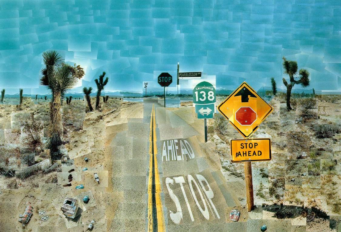
Pearblossom Highway, by David Hockney. This is a work is a photographic collage. Hockney took hundreds of photographs in order to compose this piece. It is very interesting due to its piecey texture, the rectangles of each individual photograph. This work initially drew my attention because of its interesting uses of scale. The photographs as a whole looks like a realistic setting, yet you notice that the sizes of objects within do not exactly portray actual perspective. Aside from the collaboration of images, the work utilizes an attention grabbing color scheme. The foreground consists mainly of shades of yellow orange and red, and dances nicely with the contrast of the blue sky. Due to Hockney’s color present here, the viewer’s eyes jump back and forth between foreground and background. The deep, and perhaps shocking red in the signs adds a pop and a focus point to the piece, which makes one question the meaning of the photograph. Is it merely the capture of a place, or is it a warning not to go further?
image essay #8

Birthday Boy, by Eric Fischl. Eric Fischl's paintings deal with the coming of age for mainly young adolescent boys. In Birthday boy, Fischl portrays a young boy on a bed with a much older woman. Both figures are portrayed nude. It is unclear the exact relationship between the two, but nonetheless we get the sense that the boy is seeing something he should not. There is certainly a feeling of inappropriateness, and uneasiness for the viewer. I believe the first reaction is that one should not be looking at the two of them, as if the viewer is invading their privacy. Yet when you allow yourself to look further there is this uncomfortable ness. We question why is this young boy with, and looking at the woman. Also the positions of the two figures give way to further questioning, such as why the woman’s legs are spread. They are very suggestive. It is unclear to me whether the woman’s left leg is simply in the foreground or actually touching the boy’s shoulder; the answer could lead the viewer to secondary questioning. Fischl does have an extraordinary capability of color. The painting has this remarkable red and gray tone. I believe that the red makes the viewer feel embarrassment, and also may imply sex, passion, exploration and temptation. Birthday Boy is a very successful painting with its interesting subject of the boy approaching puberty, as well as its great use of color.
Tuesday, April 22, 2008
image essay#7

Sally Mann displays brilliant value in this 1992 photographed titled, Shiva at Whistle Creek. Mann has a fantastic capability of captivating a person with her rich contrast in photographs. There are many different values inherent in each of her works, and this photograph is a great example of her professionalism. She has a way of focusing on the subject, but also allowing the subject to appear soft and welcoming, there are no edges that are to harsh. The way in which she captures her subject, with the enormous ability of seeing detail, one can almost see color. This photograph is very alluring, there is the sense of both watching the young girl from above, or what I feel almost instantaneously is that I am the young girl. Perhaps Mann is invoking these positions onto the viewer. In any case, the image is calming, and certainly captures a setting in which you can hear the trickling of water, and image the cold, feeling the innocence and the freedom of a child.
Thursday, March 27, 2008
image essay#6


I attended Daniel Graham's lecture last evening, and to my surprise I was left more inspired than I could have imagined. Daniel Graham's lecture was quit fascinating to me. I believe that first of it was his character that captivated my attention. He presented himself as a very genuine man. He did not fear being humorous, and that was a quality I much admired. His reflection on his work, however, is what most enthralled me. When he spoke of his art pieces they were not this simple concept behind the work, but these elaborate metaphors on life that pertained to every single material he used within a piece. There was a tremendous dialogue I saw between him and his art; this poetic chemistry. Everything had detail and was thought out. The greatest attribute to his work was that he intertwined his memories (whether embellished or not).I related to Daniel in this sense because I articulate reason for every inclusion of material; I really appreciated his thought process.
The workshop this morning was very interesting. We began with an exercise as difficult as re-writing a fairy tale. It was trying to come up with a reclaimed story in a matter of minutes, yet the practice was worthwhile. After that portion we went on to make a list of phrases that would illustrate our feelings or memories towards a color. At the end of this we used one line from the fairy-tale retelling as well as a line from the color depictions, making a brand new unlikely sentence. Mine was: "She could see the future, dull, verging on passion." Then in groups of eight we took each of our sentences to form a story. Daniel's purpose behind all of this was to show us, how at first our ideas lack what it takes to make pieces of art; and that through examination and combination we can create a more profound work that relates a larger variety of feelings and emotions.
From our group’s stories, we created characters that pertained to our own sentences. We were instructed not to merely illustrate our sentence, but rather create a character or picture that contributed to the purpose of our sentence. I chose to draw binoculars that were a way I imagined my character could "see the future." Than we collaborated to create a scene in which all of our characters interacted.
I enjoyed this workshop very much, and that it was a great way in which we could tangibly explore our imagination and further our own understanding of our ideas.
Thursday, March 20, 2008
image essay#5


My hope is that what I am taking so much time to do with this project, taking risk and making this piece a true example of my concept, is evident now even in the beginning stages. I am quit aware that I have so much work ahead of me, but I am not fearful or discouraged but mainly exited and dedicated to the execution of the piece. Instead of 11x17 paper I am using a 17x24 piece of ply wood that I painted white. The image is drawn on symmetrically, and where the "halo" is around the figure-I've painted it gold, with yellow beam lines. I incorporated color into the piece because I think it makes the concept and the symbolism three-dimensional. For me the color yellow is representational of God, light, warmth, and love. It is also the color that is typically used as the color of halos in paintings. So my using it draws the viewer to the irony of this glowing religious and violent figure.
I also chose the wooden board because I plan on attaching my textures not by gluing them to the surface, but rather nailing then to the board. I thought of using nails because there is a sense of drama with them and the literal "hammering in" of ideas. I believe in the finished piece you will be able to see the image, but also there will be these nails that extend forward; and from the side angle of the piece you'll be able to see the amount. Also I am using mostly, if not all, transparency papers for the texture, rather then normal paper. I feel that by using transparency I will have this great effect of overlap; and conceptually I am using transparency paper because the terms in which I am voicing 'wrath' are not transparent--they are complicated and under communicated, so once again I'm playing with irony.
I am sorry that I can not physically show you gestalt principles in the piece do to lack of texture at this time; however I can assure that those principles will be applied with the utmost concern.
Wednesday, February 27, 2008
image essay #4

This painting entitled "Beethoven frieze: The desire for the luck," was painted by Gustav Klimt one of my favorite painters. He so eloquently details his paintings with elaborate textures and designs that are extraordinary for anyone to look at. When first viewing this painting I notice the stark gold of the knight against the white background. It is clear that the knight and the women dressed behind him are the object of our immediate attention. Then our eyes follow back to the left where the nude people stand pleading. Also from this portion of the frieze we also see one woman in the upper left corner on a cloud. The piece has a true sense of omission played by the knight ignoring the pleas, as well as the spaces that are without texture. The way the nudes are painted is relevant to there emotion. Their bodies are sharp and fragile. Perhaps these people are begging for money, are maybe more simply clothing. In either case the knight appears selfish and arrogant along with the women behind him appearing in vanity. The piece is agile and thrilling. There is a certain sense of romance, as in all of Klimt's painting; however this is counter played by people desperation. This piece is beautiful.
image essay #3

This image by Bansky is very interesting to me. It is extremely striking. Upon viewing the image something within me is stirred. I believe that this has happened with this image, along with most other Bansky imagery, because he plays with emotion, culture, reality, and what in our society is too commonly un-talked about. This image portrays a young girl with a bloody nose standing amongst the wreckage of houses, possibly her own. The image is immediately striking because the child is crying, holding her teddy bear, bleeding, with fear and lonesomeness. Bansky has created a piece that is exceedingly powerful using imagery that is recognizable. I believe that the girl is possibly located in New Orleans. There is a couple of Red Cross workers who are about to approach the girl, however television media are preventing them from aiding her. There is a camera man, a photographer and what appears to be a producer. The three men are trying to “capture a moment” using the image of the child as a sob story for the nation. The image is compelling and heart breaking. Bansky has used honestly black and white to expose the rawness that is this scene. He also splashes some red on the girls face and in the uniform crosses. This image creates tension both literally and figuratively within the context of two-dimension. The piece exhibits well thought out meaning with thoughtful symbols. Bansky’s image is very successful and a favorite of mine.
Wednesday, February 13, 2008
{blog entry 2}

I believe that this piece has the great ability to keep your eyes moving. The image contains much movement with the motion of stirring, and the objects that are tangled within the action. I feel that this piece has a high level of investment and that is clear to any viewer. The elements in this piece including: a spoon, a cup and saucer, a tea bag, swirls, and splashes of tea, make the viewer’s eyes stay. The meaning is apparent pretty soon after the viewer first looks at the piece, however, because of the attention to detail the viewer wants to keep looking. I believe I created a true sense of definition all throughout the piece, displayed in several different textures. There is a wonderful quality of scale; the spoon is very large as is the tea bag. An interesting portion of the piece is the tea bag string that is exaggerated in proportion and appears to be rope-like. The perspectives also change throughout the piece particularly with the spoon. The top of the spoon seems to be extremely close to the viewer’s eyes, and then extends backwards into space. The craftsmanship in this piece is also very well done. It is clean with little or no smudges. I think this piece is successful.
Monday, January 21, 2008
Image Essay #2

M.C. Escher has brilliant take on a self-portrait in his lithograph "Hand with Reflecting Sphere." The image is so intriguing and gripping, first because it is unlike any other self-portrait I have ever seen; with the area of focus, the artist himself, contained in a metallic sphere. Your eyes simply gravitate inward towards him, as all existential groupings form around him. The little objects surrounding him suction your eyes. The focal point is further attributed by the brilliant use of dominant black around the sphere. Even though the black is dominant, it forces the eye towards the more concentrated. The way in which the hand begins at the edge of the paper and moves towards the center is yet another brilliant way in which Escher calls the viewer to himself. The composition has a stunning balanced shown greatly in his use of the black and white distributed equally; as well as the shapes that are placed according to their visual weight.
+ another intresting fact about this painting is that M.C. Escher was left handed, as reflected in the sphere, however, the hand in the foreground is his left hand also, contradicting the reflection.
Tuesday, January 15, 2008
Image Essay #1

Large Interior W11 by Lucian Freud
Upon viewing this painting, the first thing that attracts the viewer is perhaps the color. A mustardy yellow glazes the surface of the painting, a toned-down brightness. The painting has an offset balance; in the right foreground there is a heavy distribution where the people sit. The left background is rather empty its only real weight is the sink and faucet in the corner. It is a little unsettling this way because it feels as if the people are leaning towards you, it feels uncomfortable. The composition is certainly asymmetrical, there is no mirroring in the painting, and your eyes cannot help but move around. An interesting aspect of the painting is that it incorporates the use of the triangular hierarchy, whether or not the people’s positions are telling of their importance. The young man is at the top, and so go our eyes to the two young women on his right, following the women on his left, and finally the young lady on the floor. The viewer begins to assess who these people might be, and why they are in this room. The clump of people exhibit the most dominance throughout the painting, they cause the most investigation.
Overall the painting is well composed and an intresting one to spend time on.
Wednesday, January 9, 2008
biographical statement {blog entry 1}
After walking and talking, I believe the first concept my parent taught me to do was to draw; later came painting and gluing miscellany together. There has always been for me this profound yearning to create, as if I need it. Manipulating raw materials and fashioning them into beautiful works is not only thrilling, but it is captivating. I have always felt that art is something I can do, and do well. I have explored as many areas of art as I could think possible. I have been highly involved in musical theatre as well as choirs and ensembles. Art is oh so rich and consuming and every part of who I am calls me to more of it.Many of the ideas I conceptualize first come from what I see visually around myself. My environment plays a deep role in my personality, and it is often something I try to emulate in artwork. The earth, creation; trees, birds, flowers, people, all the moves and breaths enrapture me. to be able to capture a person (in any medium) sharing with the viewer who this person is by merely portraying them visually is absolutely fascinating; exploring how to successfully do this is something I would like to learn. The other source for my ideas or rather influence is my trust in and relationship with God. I am a Christian and I see that all things in nature shout His name, they scream his existence and beauty; and as part of His creation, I want to do the same. I feel as fortunate as to have artist gifts, and to attempt to imitate the creator Himself. Much of my responses in art come from personal examinations of my relationship with God or from Biblical text.I learn the most when I am showed examples of other peoples work, seeing something visually resonates with me far better than directions.
Subscribe to:
Comments (Atom)
